What We Do In The Shadows Movie Poster and DVD Cover
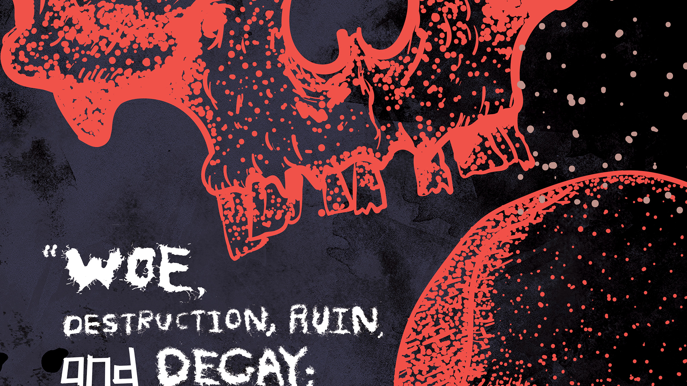
To test my skills as junior-level designer, I was assigned a project to create a poster, DVD package and develop a film title opening animation (soon to be attached) from a chosen film. I selected "What We Do In The Shadows," a vampire-horror mockumentary by Jemaine Clement and Taiki Maititi. The identity for the poster contains references of scenes and symbolism within the design. The polaroids, in the film, were demonstrated within a scene of the movie where the vampires began using 21st Century technology for the first time. The angles of the images are very offset in the manor to give the "clumsy" humor of the vampires using a camera for the first time. Each scene is able to remain diverse enough to demonstrate a sense of horror and humor within the film. The polaroids are placed upon the texture of an antique table covered with blood splatter. The vampires within the film are all roommates and live together in old house. Being vampires, they often lure their victims into the home and feast upon them. Early in the film, the vampires try to place newsprint upon the floor to keep the house more cleanly. The typefaces used within the design are abstractions of the typefaces Raleway and Potsdam. The gothic typeface instills the element of horror in the film, but also is used in reference to the films location of New Zealand. It presents itself as very bold, sharp and powerful, all traits given to vampires. All images were illustrated to embrace the films indie-production quality that is often associated with mockumentary films. I wanted to keep a simple 3 color palette of crimson red, black and white to give the illustrations a simple pop in appearance, These colors are often associated with vampires, and I did not find it necessary to have a large palette. All of the vampires illustrated have blood dripping down their mouths, contrasting with the complete white of their skin tone. Small amounts of yellow and brown are also used to give images a larger tonal palette. The re-design of the films poster becomes the cover of the DVD artwork and influence to the disk design. Each DVD is mocked up with a crimson background, amplifying the imagery of blood in association with vampires and horror films. All text on the back and front of the DVD artwork comes from the original DVD packaging.
You may also like


